Apple has long been known for its attention to detail, exceptional aesthetics, and commitment to a seamless user experience. However, one particular design decision has persisted in a cloud of confusion and criticism: the placement of the charging port on the bottom of the Magic Mouse. Despite the release of a new USB-C version, which replaced the Lightning charging port, this curious design choice remains in the Magic Mouse 3 unchanged. In this article, we’ll delve into the implications of this decision, explore the user experience, and consider whether it aligns with Apple’s reputation for innovation.
A Brief History of the Magic Mouse
Introduced in 2009, the original Magic Mouse wowed users with its multi-touch surface and sleek design. At that time, it relied on removable batteries, allowing users to continue using the mouse without interruption by simply swapping batteries as needed. Fast-forward to 2015, and Apple released the Magic Mouse 2, equipped with a built-in rechargeable battery. Unfortunately, this new version had one glaring downside: the charging port was placed on the bottom of the mouse.
From a technical perspective, one can argue that the choice of a bottom-mounted charging port might have been a design necessity at the time. However, this design flaw quickly became a point of contention among users. Critics pointed out the absurdity of needing to flip the mouse over to charge it, rendering it unusable during that time. While many claimed that a quick charge could restore functionality in a matter of minutes, the interruption to workflow was nonetheless frustrating.
User Experience: A Design Oversight?
User experience (UX) design is predicated on the principle that products should cater to the needs of users rather than forcing users to adapt to the product. It raises a question: why has Apple not made any significant changes to the Magic Mouse, particularly regarding the placement of the charging port?
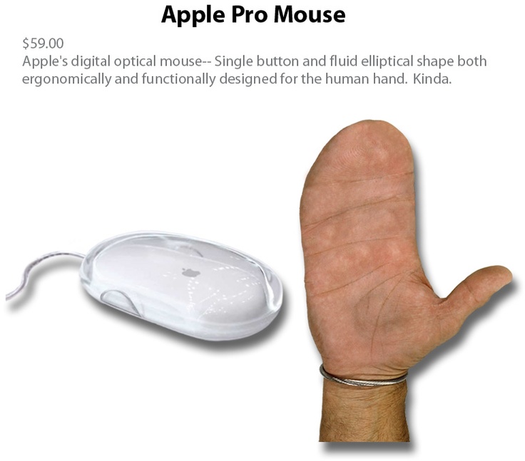
In the time since the Magic Mouse 2 was launched, a wealth of user-experience critiques has accrued. Many users have taken to social media and various online forums to voice their frustrations about the design oversight. Memes mocking the inferior placement of the charging port have become a staple of the internet, illustrating the profound disconnect between Apple’s design philosophy and user needs.

Interestingly, some alternative solutions have emerged, indicating that the design flaw is not insurmountable. Innovators have developed ergonomic grips with magnetic charging options or Qi wireless charger support. However, these workarounds are not integrated into Apple’s design. The result is an unfortunate situation where users must either endure inconvenience or rely on third-party adaptations.

The Debate Over Charging Time: Minute vs. Essential
One argument that Apple proponents often put forth is that charging the Magic Mouse 3 takes only a few minutes, which minimizes the impact of this awkward design. Critics counter this perception by emphasizing that those few minutes can be essential during critical tasks. Imagine being in the middle of a presentation, design work, or coding session when your mouse dies; the need for uninterrupted workflow transcends the seconds saved in a quick charge.
Other Apple accessories, like the Magic Keyboard and Apple Trackpad, can be used while charging. This inconsistency raises eyebrows and enhances the frustration surrounding the Magic Mouse 3. If users can continue their tasks with other Apple products while charging, why isn’t the same functionality available for the Magic Mouse 3?
The USB-C Update: A Step Forward, but Still No Solutions
Apple’s recent announcement of the USB-C-equipped Magic Mouse 3 has generated excitement among many users who were eager for a more modern charging option. Nonetheless, the new version’s charging port remains situated on the bottom, reinforcing the idea that Apple either does not recognize or does not care about the criticism surrounding this design choice.
While the shift from Lightning to USB-C is undoubtedly a positive change, it doesn’t fully address the user experience pain points associated with having to flip the mouse over to charge it. Apple has positioned itself as a leader in innovation, and yet this aspect of the Magic Mouse 3 feels outdated, akin to a relic of a bygone era.
Apple’s Response: An Inexplicable Silence
Given the multitude of criticisms and the strong user sentiment surrounding the Magic Mouse 3 design, it’s astonishing that Apple has remained largely silent on the issue. Many of the company’s updates to its product lines have been driven by user feedback and the desire to improve user experience. However, in this case, the company appears to have ignored widespread criticism and accepted the status quo.
What is equally interesting is the fact that even Apple’s CEO, Tim Cook, has found himself at the center of the criticism on social media, with many responses to his product announcements highlighting the unfortunate placement of the charging port. This level of user backlash is a strong indicator that the design decision is not just a minor oversight; it’s a significant branding misstep for a company that prides itself on innovation and user-centric design.
Looking Ahead: The Future of the Magic Mouse
As we consider the future of the Magic Mouse 3 and the potential for evolution, it becomes clear that Apple must act decisively. User feedback has consistently pointed to the need for change, and consumers are becoming increasingly vocal about their frustrations. The question is whether Apple will choose to listen and adapt or continue down a path of indifference.
Moving forward, it might be beneficial for Apple to explore innovative design concepts that better accommodate user needs. Whether it be repositioning the charging port, integrating wireless charging capabilities, or designing a versatile charging solution, the possibilities are numerous. Apple has an opportunity to leverage its design expertise to create a product that both respects its users and enhances the overall experience.
Conclusion: Time for a Change?
In a world where user experience reigns supreme, it is surprising that Apple has not addressed the glaring issue with the Magic Mouse’s charging port. While the introduction of USB-C is a welcome improvement, it does little to mitigate the bigger problem of charging functionality. As we await further developments, the hope is that Apple will recognize the importance of user feedback and act decisively to innovate and create a Magic Mouse 3 that aligns more closely with the expectations of its dedicated fans.
Ultimately, the question remains: can Apple turn this curious dilemma into an opportunity for real change? Only time will tell—until then, users will continue to deal with the quirks of the Magic Mouse 3, one flip at a time.


