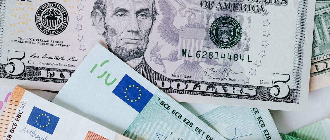
Currency design, an integral part of a country’s history, can trace its roots back to the nation’s inception. In the evolution from bartering items and services to the adoption of gold and silver, we witness the emergence of the two fundamental forms of currency we recognize today: coins and notes. The UX of currency serves as a reflection of a nation’s identity, encapsulating its history, motto, and the heroes it reveres. Moreover, it underscores the values of accessibility and inclusion embraced by that society.
Taking everyone into consideration is the primary aspect of accessibility, That includes the disabled, the marginalized, the un-included. After all, what good is a currency if it cannot be spent? The best coins and notes are the ones that can be handled by everyone.
Currency Design: Exploring UX of Coins
Coins clatter as they fall to the ground, yet these are certainly the most accessible among coins and notes. Visual impairment is the most common limitation that people face while comparing currencies. Another limitation, which is sometimes not considered to be an accessibility limitation is illiteracy. Illiteracy, which can be referred to as a quiet disability, impedes a person in dealing with currencies.
In India alone, there are 287 million adults who are illiterate. While a government should constantly endeavour to eliminate illiteracy, we should also consider the illiterate population while designing currencies and how they too can seamlessly deal with currencies.
India combated illiteracy with currency design in the Hasta Mudra (hand gestures in classical dance) series in 2007, The literacy rate was only 67% countrywide. 287 million adults could not read.
Enter the Hasta Mudra series, an initiative taken by the RBI (Reserve Bank of India) in 2007 where the coins were redesigned in such a way that even the illiterate of the nation could distinguish each one.
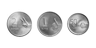
The number of fingers depict the value of each coin making it a very accessible design. However, visual impairment also causes people to struggle with currencies. What is the use of the brilliant Hasta Mudra design if people cannot see it? Hence we bring in tactile differences. Take a look at the Euro, one of the most common currencies in the world. It has groves and different edges that allow for people to differentiate between the coins simply by feeling them.

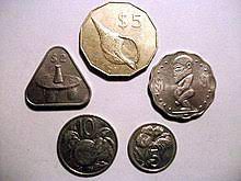
Another clever way is by changing the shape and size of your coins. Once again, people can tell the difference by the shape. Lots of coins are becoming pentagonal or hexagonal or simply have wavy edges. A rather cool looking coin is the triangular one of the Cook Island.
Currency Design: Exploring UX of Paper Notes
Let’s move onto the other half of currency – paper notes.
Despite the USA being a world superpower, it is the only country, along with Canada, to have its paper bills the same size, color and shape for all denominations (Canada still has tactile differences at the top of their notes). Sure, they have pictures of their presidents and pretty quotes and even national landscapes, but if a person cannot see them, how will it fulfil its ultimate purpose – to be spent?

In 1928, the sizing of US notes was standardized. That means all the notes have the same size. While redesigns have been frequent in the fiat money of America, they have all been security redesigns. These are discreet details that prevent counterfeiting. To the government, it is a success. To the people, nothing has changed. However, some communities have taken a stand, namely the American Council of the Blind. They filed a lawsuit in 2008 against the lack of accessibility in the dollar. In 2016, a number of design changes were announced to be implemented in the next redesign.
Luckily, other countries have evaded this. Switzerland and France have played around with colors and it shows in their currency, The colors are bright and vivid and easy to tell apart from each other.
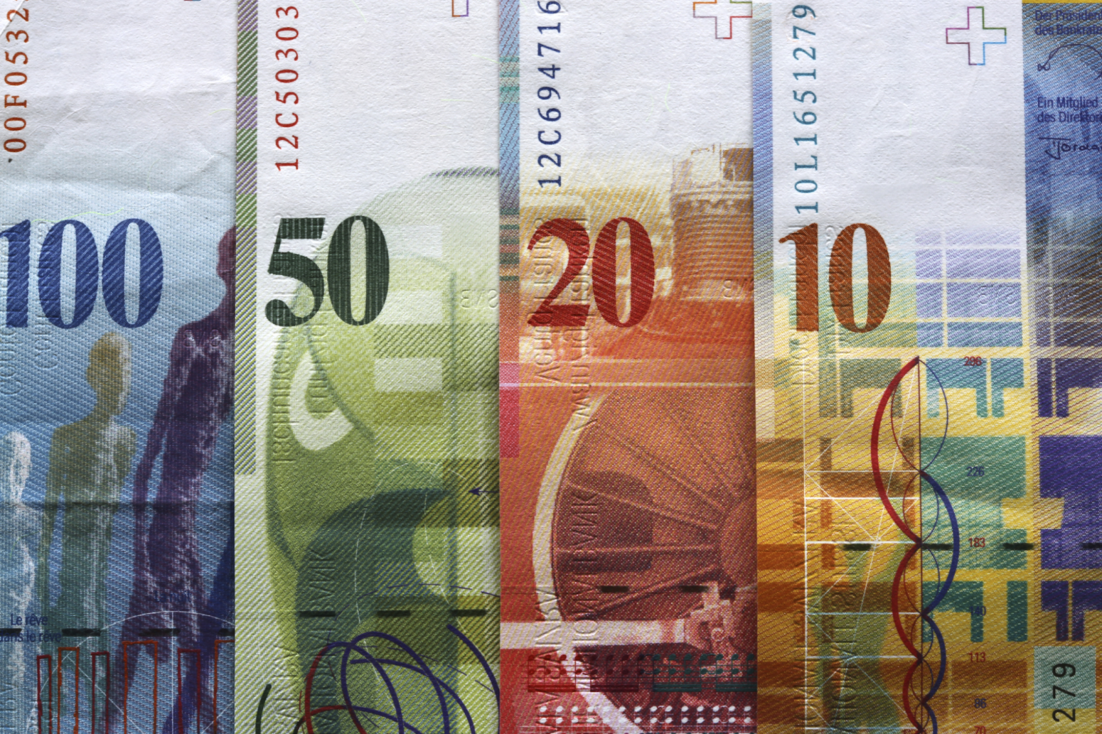
The Euro and Rupee banknotes have gone a step farther and have done it even better. Their notes are of different colors and sizes. The smaller denomination notes are simply smaller and the larger one a bit bigger in size.

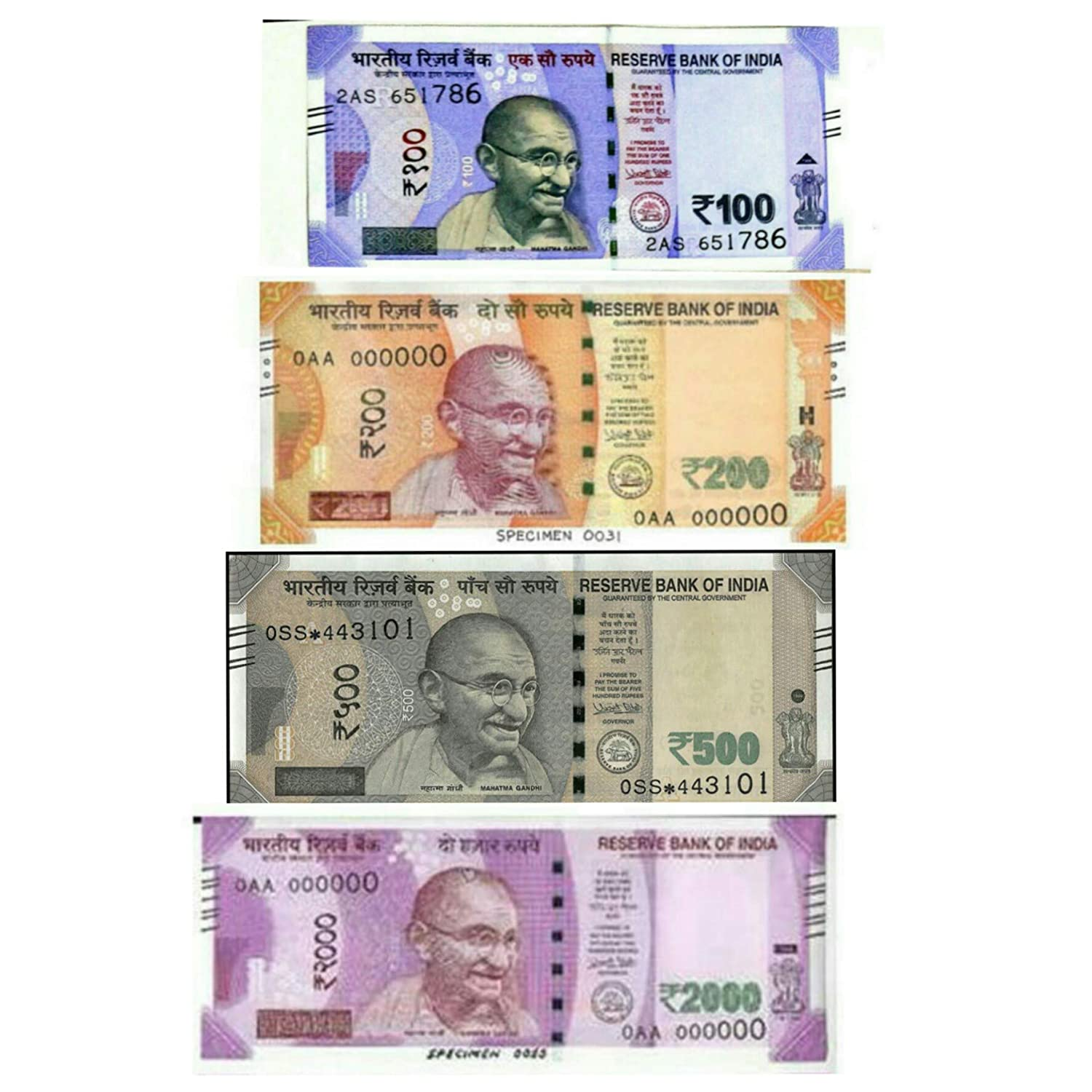
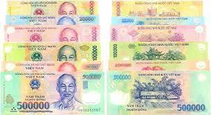
Colors seem like a great and easy way to afford accessibility. Yet, some countries get it wrong. Let’s take Vietnam here. Their notes are all a different color but with the dull, unvaried palette, the Vietnam Dong notes aren’t all that easy to tell apart especially by color-blind users
In the world of currency design, fully cashless societies are not common. Many places are still developing, with rural areas and people facing difficulties. In these areas, user experience goes beyond digital screens and becomes essential in the physical world. Even with advancements in technology, actual cash will likely be around for a few more decades. It’s our job as a society to imagine solutions and make them happen, ensuring that currency design keeps getting better.
When UX is taken into account, the entire global community is positively affected!


